Navigation & Interface
Last updated 5 months ago
Dashboard Layout
The Analytics dashboard is organized into three main areas:
Header — Top bar with global controls
Sidebar — Left navigation menu
Main Content Area — Charts, tables, and KPIs
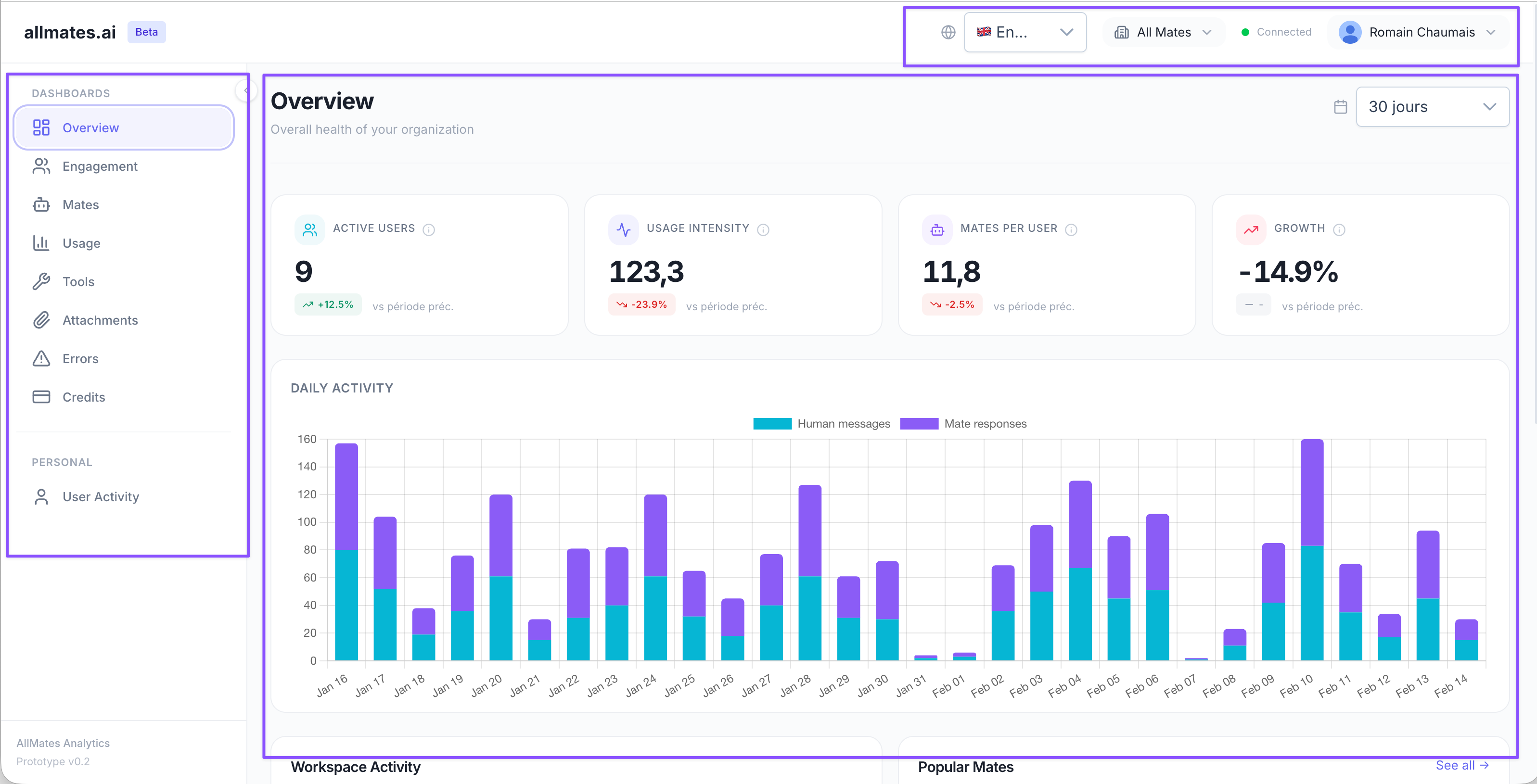
Header Components
The top bar contains the following elements (from left to right):
Connection Status Indicator
The connection status dot shows the real-time connection to the analytics backend:
🟢 Green (Connected) — Data is live and up-to-date
🔴 Red (Disconnected) — Cannot reach the backend
If you see a red dot:
Refresh the page
Check your internet connection
If the issue persists, the backend may be temporarily unavailable
Sidebar Navigation
The left sidebar provides access to all dashboard pages, organized into two sections:
📊 Dashboards (Strategic Views)
Overview — High-level snapshot of AI usage
Engagement — User adoption and behavior patterns
Mates — AI assistant performance metrics
Usage — Token consumption and cost tracking
🔍 Details (Operational Views)
Tools — Tool usage and performance
Attachments — File upload and processing analytics
Errors — Error monitoring and diagnostics
Credits — Polar quota and native connection costs
User Activity — Individual user deep-dive
Sidebar Behavior
Desktop: The sidebar can be collapsed to show only icons (click the hamburger menu)
Mobile: The sidebar slides in as a drawer from the left
Period Selector
Every page includes a period selector in the top-right corner of the main content area.
Available Periods
Default selection: Last 30 days
Chart Granularity
The time granularity of charts automatically adjusts based on the selected period:
This ensures charts remain readable and performant.
Trend Badges
Every KPI card displays a trend badge that compares the current period to the previous equivalent period.
Badge Colors
🟢 Green arrow up — Value increased (positive for most metrics)
🔴 Red arrow down — Value decreased (negative for most metrics)
⚪ Gray dash — No change or no previous data available
Inverted Colors
For metrics where lower is better (e.g., error rate, cost per user), the colors are inverted:
🟢 Green = decrease (good)
🔴 Red = increase (bad)