Strategic Dashboards
Last updated About 2 months ago
The four strategic dashboards provide high-level insights into your organization's AI adoption and performance.
1. Overview Dashboard
Path: /overview
Purpose: Get a quick snapshot of your organization's AI usage at a glance.
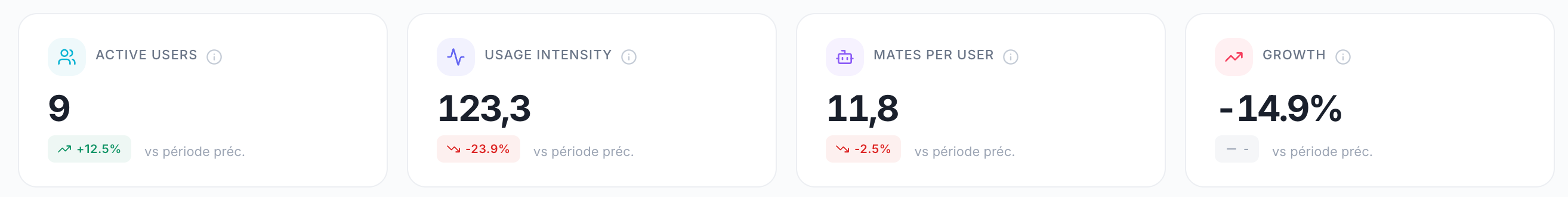
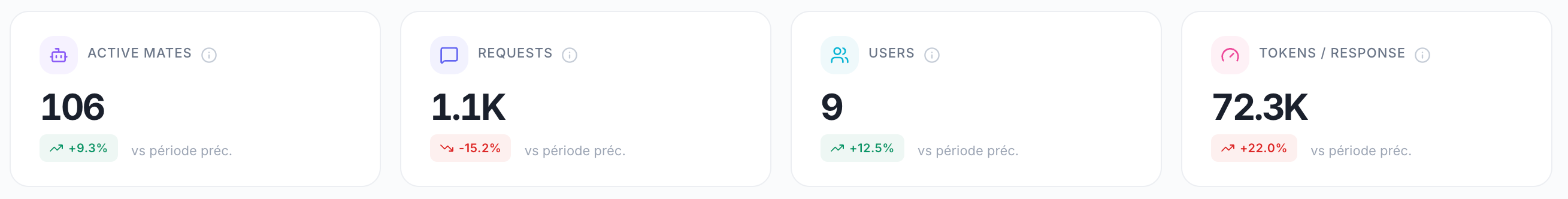
KPI Cards
Daily Activity Chart
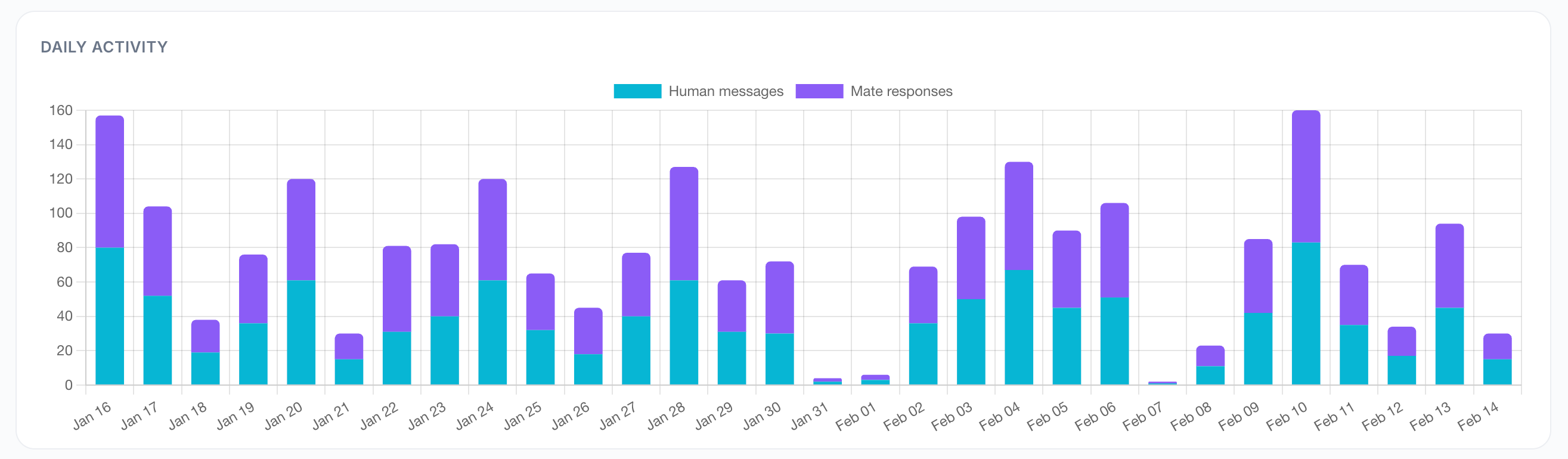
A dual-dataset bar chart showing activity over time:
Blue bars — Human messages (messages sent by users)
Purple bars — Mate responses (AI-generated responses)
Use this to:
Identify peak usage days
Spot trends in AI adoption
Detect anomalies or drops in activity
Workspace Activity
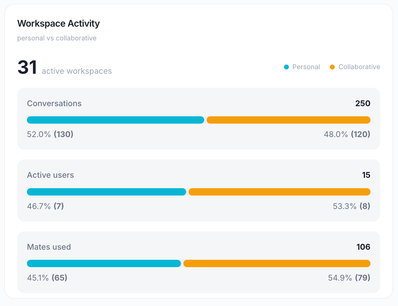
A split-view comparison showing personal vs collaborative usage:
Conversations Split
Personal — 1:1 chats between a user and a Mate
Collaborative — Multi-user conversations in shared workspaces
Active Users Split
Personal — Users who only used personal chats
Collaborative — Users who participated in shared workspaces
Active Workspaces Count
Total number of workspaces with at least one conversation during the period.
Use this to:
Understand if AI is used more for personal productivity or team collaboration
Identify opportunities to promote collaborative AI usage
Popular Mates
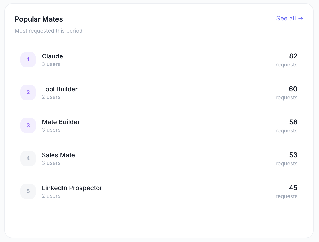
A ranked list of the most requested Mates during the period.
Displays:
Mate name
Number of requests (messages sent to that Mate)
Use this to:
Identify which Mates provide the most value
Discover underutilized Mates that may need better promotion
Inform decisions about which Mates to optimize or expand
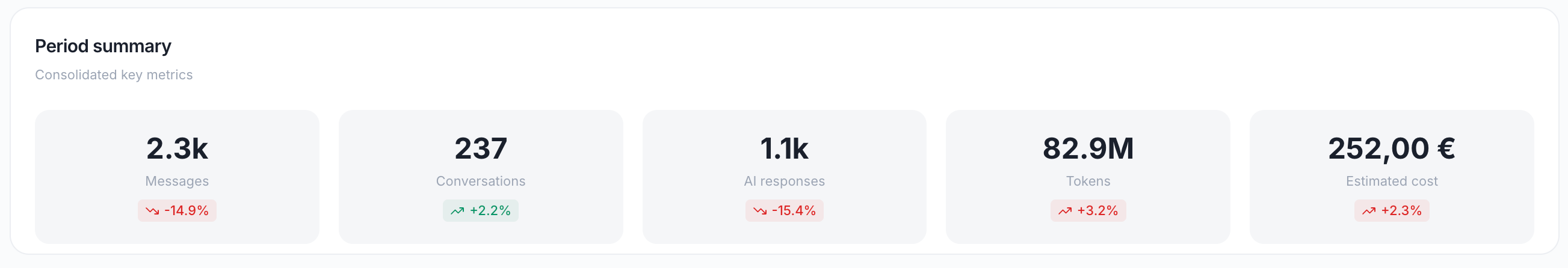
Period Summary
A consolidated metrics panel showing key totals for the selected period:
2. Engagement Dashboard
Path: /engagement
Purpose: Understand user adoption, retention, and behavior patterns.
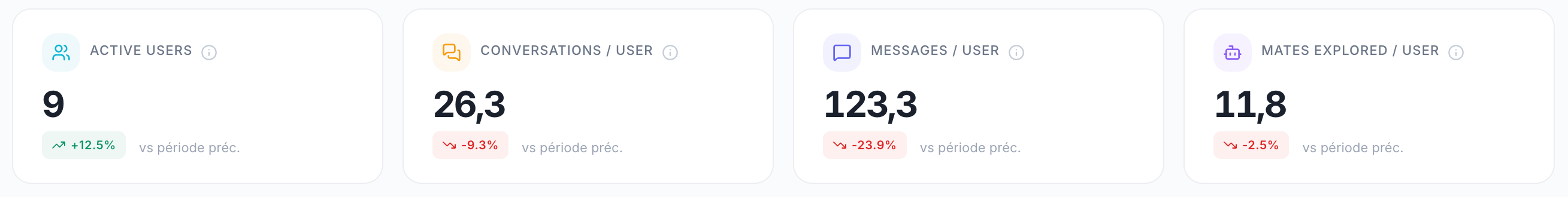
KPI Cards
Daily Active Users Chart
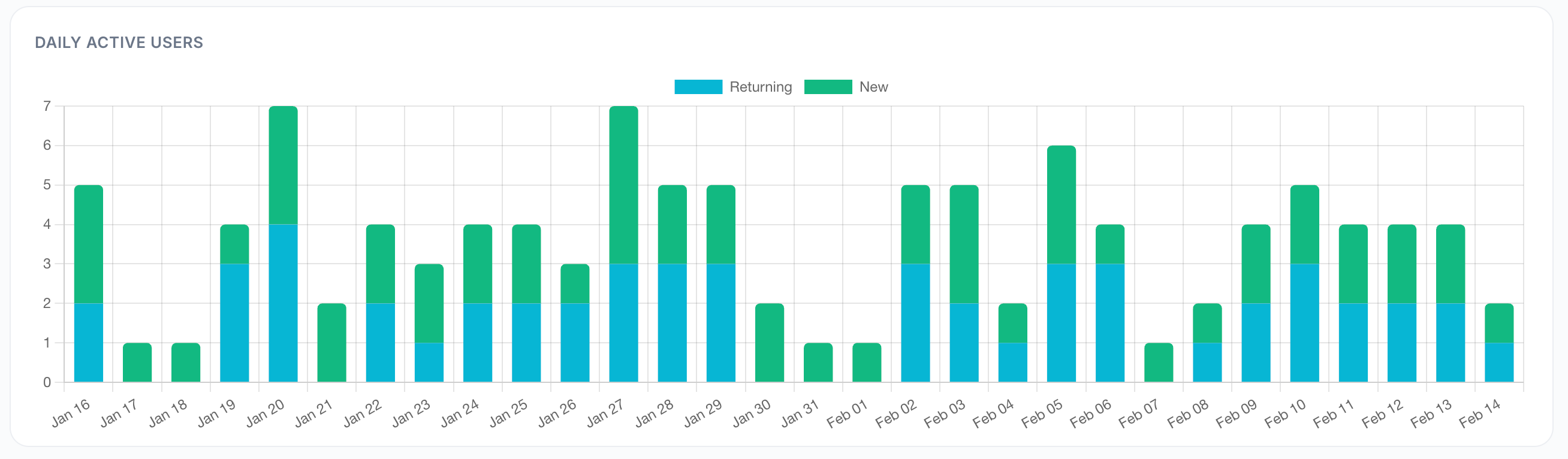
A bar chart showing the number of active users per day.
Use this to:
Track daily engagement trends
Identify days with low engagement (weekends, holidays)
Measure the impact of training or communication campaigns
Adoption Levels
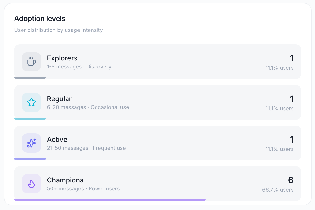
Categorizes users by their usage intensity during the period:
Displayed as: A horizontal bar chart showing the distribution across levels.
Use this to:
Identify your power users for case studies or feedback
Spot users stuck in "Discovery" who may need onboarding support
Measure the maturity of AI adoption in your organization
Activation Rate
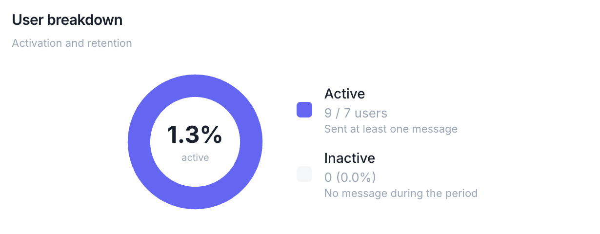
A donut chart showing the split between:
Active — Sent at least one message during the period
Inactive — No messages during the period
Percentage shown: Active users ÷ Total organization members × 100
Use this to:
Measure overall platform adoption
Identify inactive users who may need re-engagement
Set goals for increasing activation rate
User Breakdown
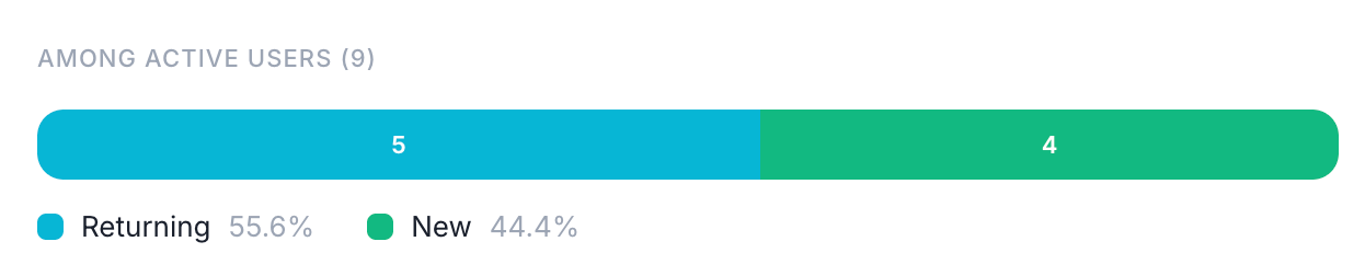
Among active users, shows the split between:
New — Joined the organization during the selected period
Returning — Were already members before the period started
Displayed as: A donut chart with counts and percentages.
Use this to:
Track the impact of new user onboarding
Measure retention of existing users
Understand if growth is driven by new users or increased engagement from existing ones
Top Users
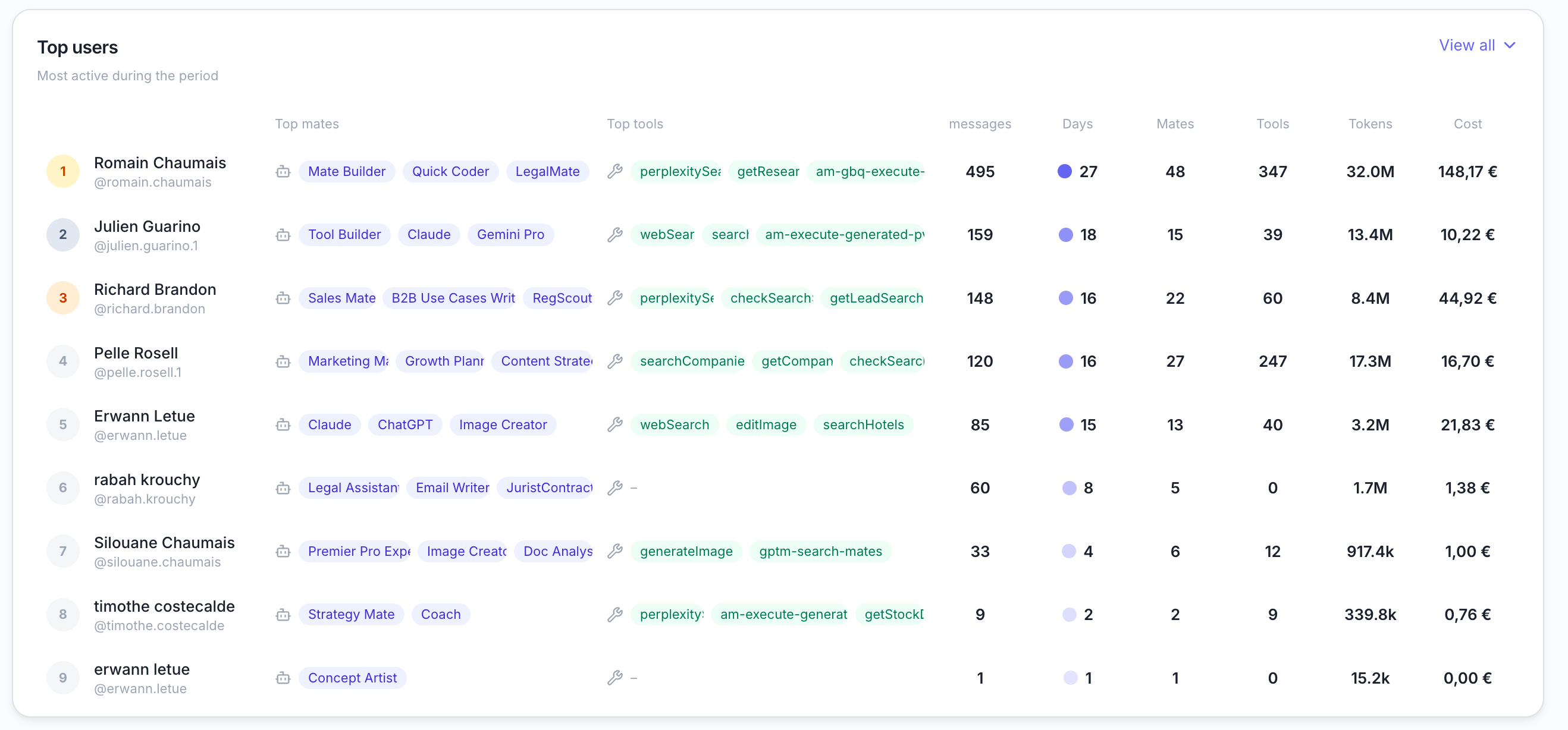
A leaderboard of the most active users, showing for each:
Default view: Top 5 users Expandable: Click "View all" to see the complete list
Use this to:
Identify champions and advocates for AI adoption
Understand usage patterns of power users
Spot users with unusually high costs for optimization
Engagement Trends
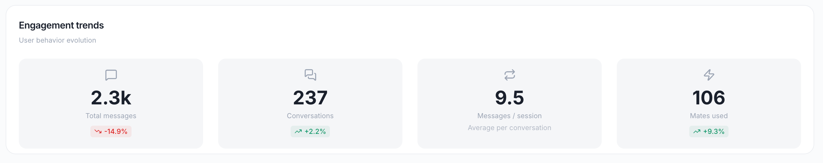
A multi-line chart tracking the evolution over time of:
Total messages — All messages sent
Conversations — Number of conversation sessions
Messages per session — Average messages per conversation
Mates used — Number of distinct Mates requested
Use this to:
Spot long-term trends in engagement
Identify seasonal patterns
Measure the impact of new features or Mates
3. Mates Dashboard
Path: /mates
Purpose: Analyze the performance and usage of your AI assistants.
KPI Cards
Mates Activity Chart
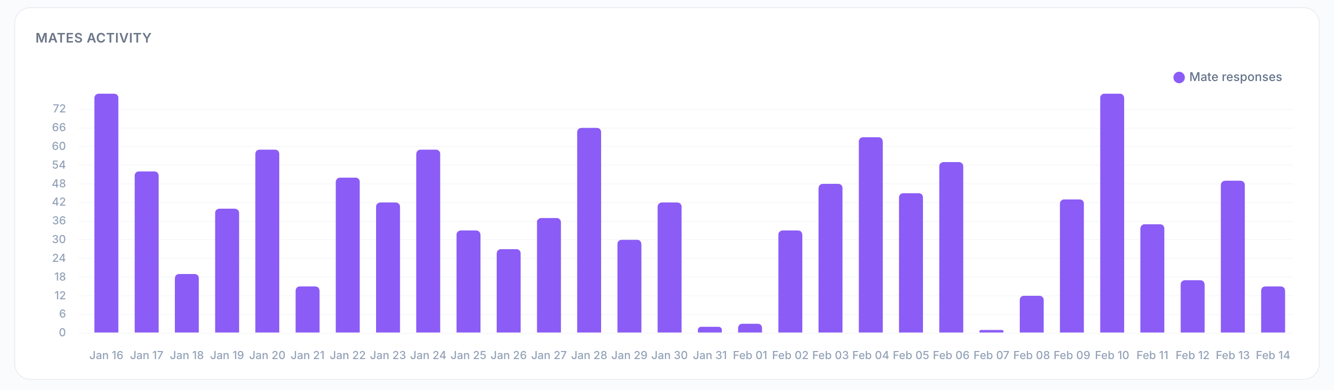
A bar chart showing the number of Mate responses generated per day.
Use this to:
Track daily AI workload
Identify peak usage days
Correlate Mate activity with business events
Performance by Mate
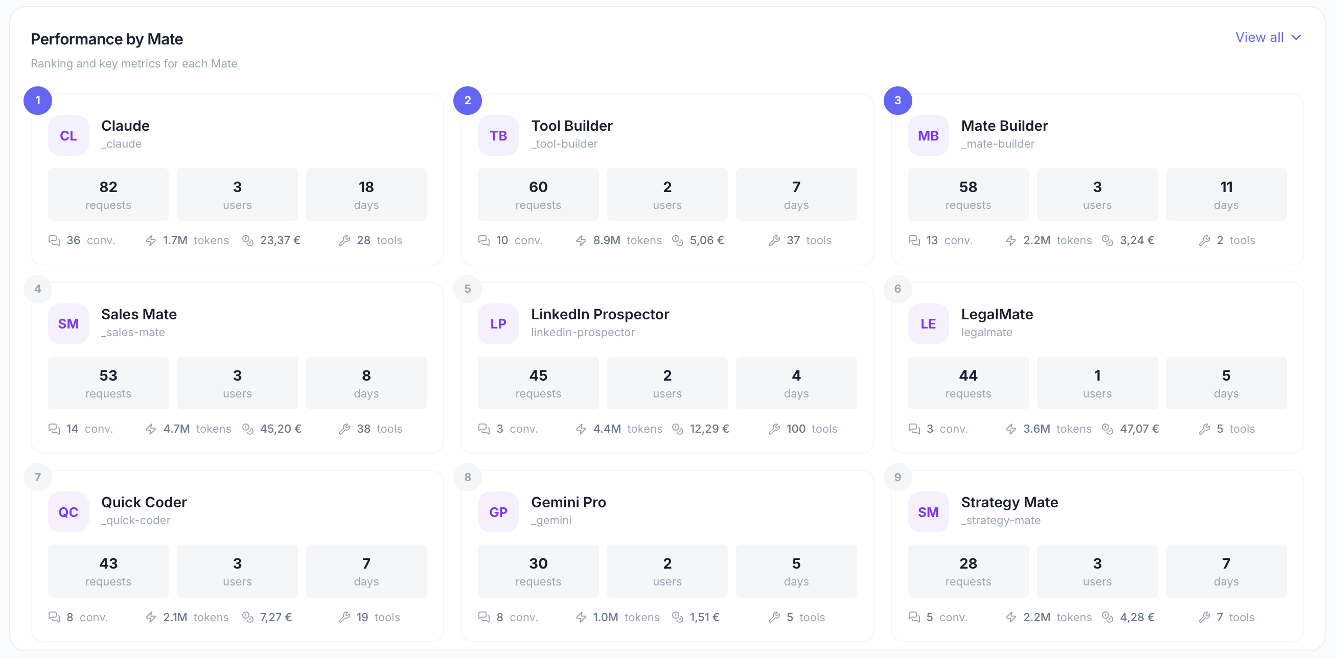
A detailed table showing metrics for each Mate:
Default view: Top 10 Mates by requests Expandable: Click "View all" to see the complete list
Use this to:
Identify your most valuable Mates
Spot underutilized Mates that may need better configuration or promotion
Optimize high-cost Mates by reviewing their prompts or models
Usage Distribution
A bar chart showing how usage is spread across Mates.
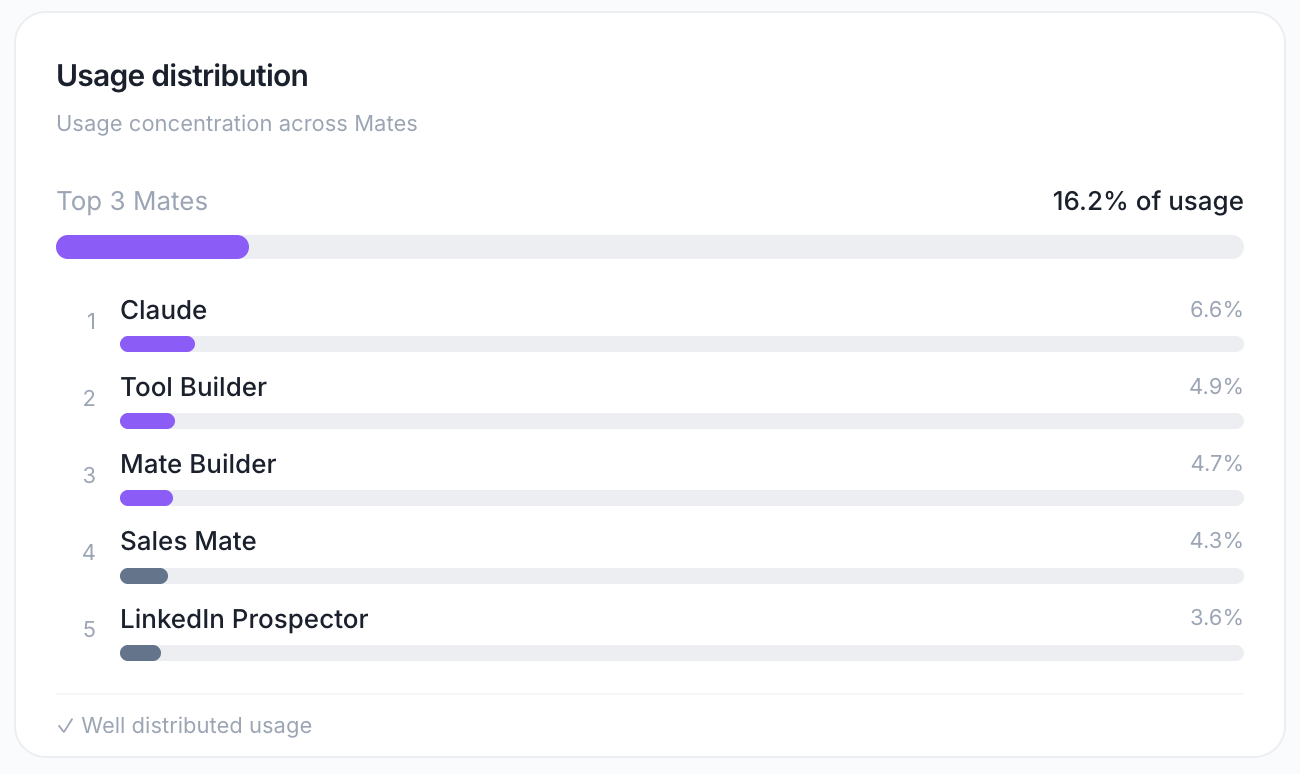
Displays:
Top 3 Mates and their combined percentage of total usage
Remaining Mates grouped as "Others"
Concentration indicator:
"Very concentrated" — Top 3 account for >70% of usage
"Moderately concentrated" — Top 3 account for 40–70% of usage
"Well distributed" — Usage is evenly spread (<40% in top 3)
Use this to:
Understand if your organization relies heavily on a few Mates
Identify opportunities to diversify Mate usage
Spot potential single points of failure
Cost Overview
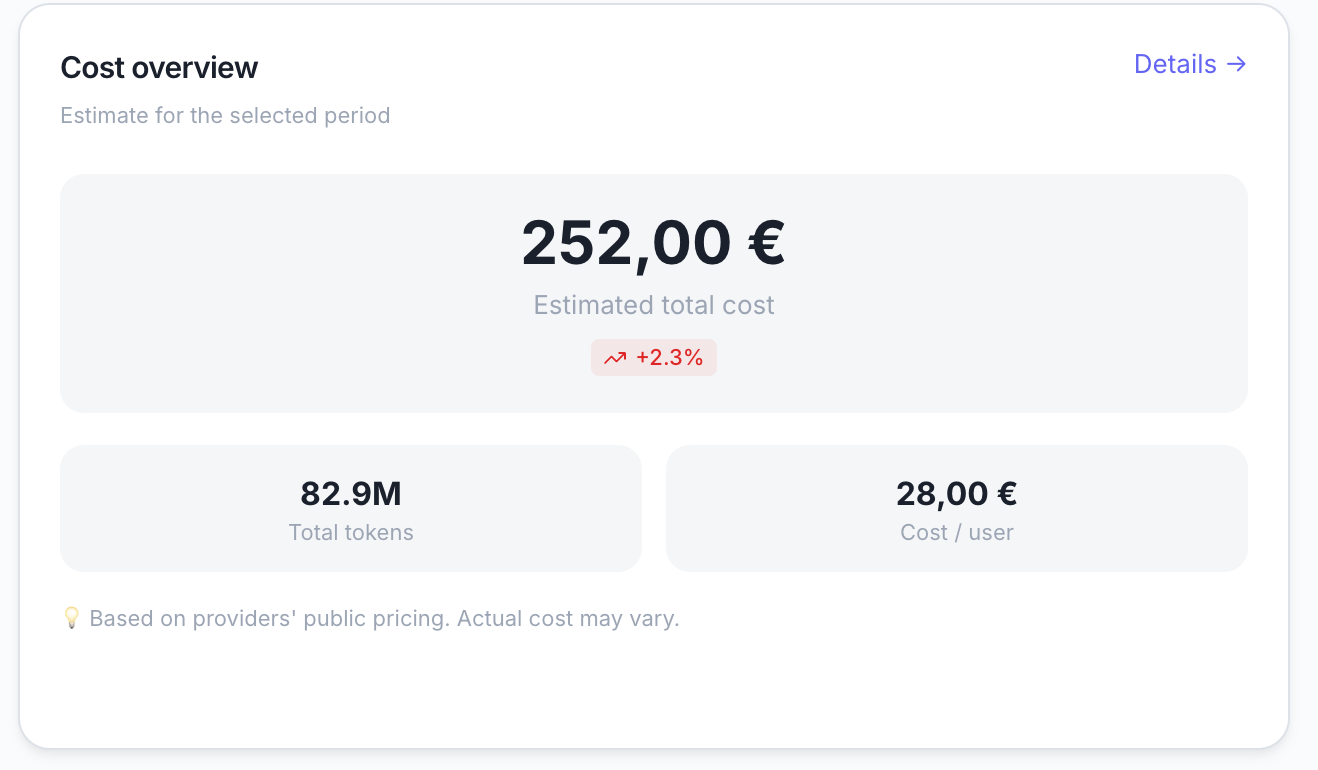
Summary cost metrics for the period:
Important: Costs reflect the Allmates API cost of your usage — the real provider-billed amount when a message runs through an allmates-managed connection, otherwise an estimate from current model prices. For your own (BYOK) connections, figures are estimates and may differ from your provider invoice.
Use this to:
Budget for AI spending
Justify ROI to stakeholders
Identify cost optimization opportunities
4. Usage Dashboard
Path: /usage
Purpose: Deep-dive into token consumption, cost tracking, and efficiency optimization.
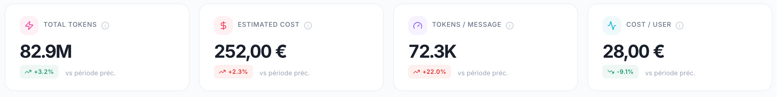
KPI Cards
Usage Evolution Chart
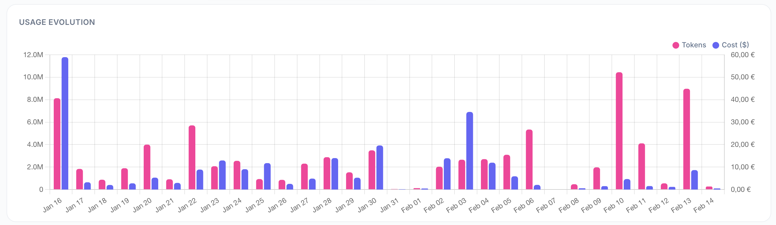
A dual-axis line chart showing:
Left axis (blue line) — Token consumption over time
Right axis (green line) — Cost in USD over time
Use this to:
Track spending trends
Identify cost spikes
Correlate usage with business events
Input / Output Split
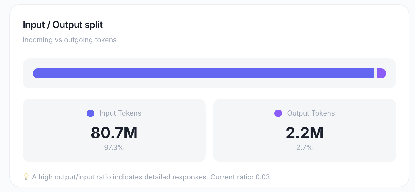
A donut chart showing the ratio between:
Input tokens — Tokens sent to the model (prompts, context, conversation history)
Output tokens — Tokens generated by the model (AI responses)
Includes: A hint showing the current output-to-input ratio (e.g., "2.3:1")
Use this to:
Understand if your Mates are verbose (high output ratio)
Identify opportunities to optimize prompts for more concise responses
Benchmark against industry standards (typical ratio: 1.5–3:1)
Cost by Provider
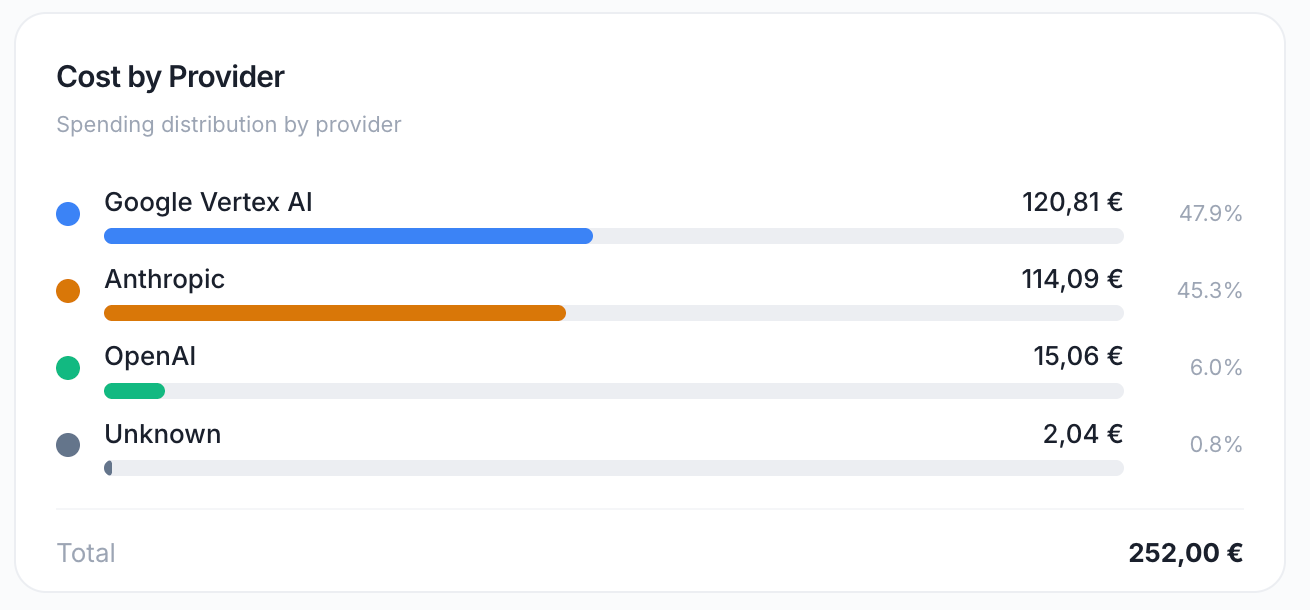
A bar chart showing spending distribution across LLM providers.
Common providers:
OpenAI (GPT models)
Anthropic (Claude models)
Google (Gemini models)
Mistral
Others
Use this to:
Understand your provider mix
Negotiate volume discounts with top providers
Diversify providers for cost optimization or redundancy
Most Used Models
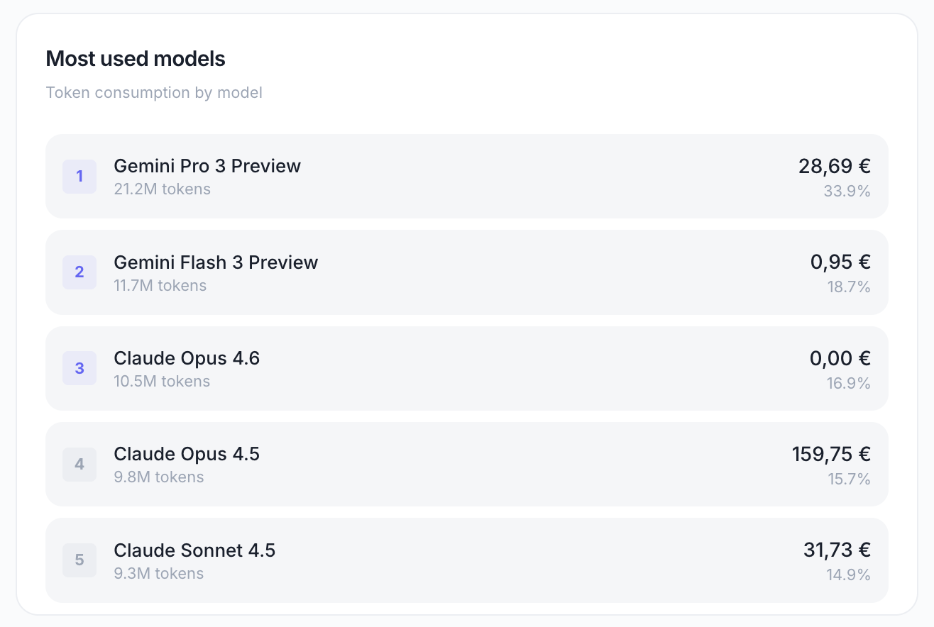
A ranked table of LLM models by token consumption.
Displays:
Model name (e.g., "GPT-4o", "Claude 3.5 Sonnet")
Total tokens consumed
Percentage of total usage
Use this to:
Identify which models are most popular
Evaluate if expensive models are being overused
Consider switching to more cost-effective models for certain use cases