Operational Dashboards
The five operational dashboards provide detailed, actionable insights for day-to-day management.
Last updated About 2 months ago
1. Tools Dashboard
Path: /tools
Purpose: Analyze tool usage, performance, and reliability.
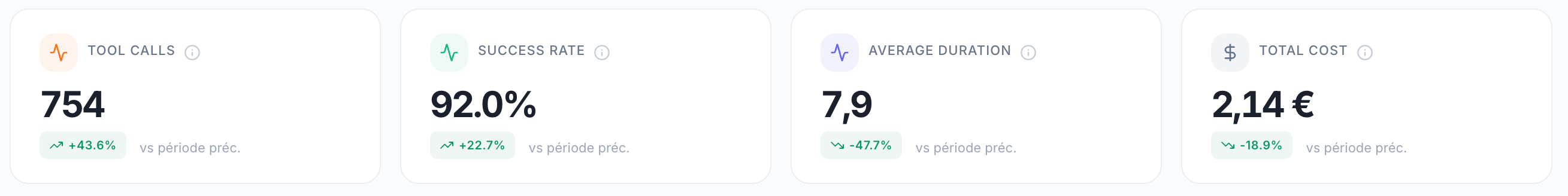
KPI Cards
Daily Tool Usage Chart
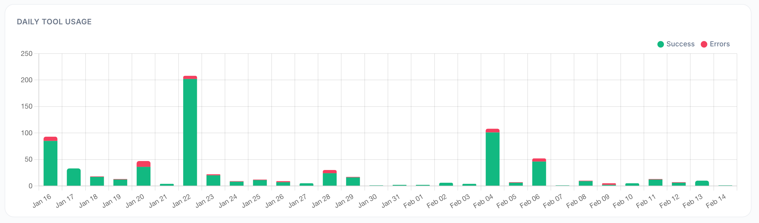
A stacked bar chart showing three datasets per day:
Total calls — All tool invocations
Successful calls — Calls that completed without errors
Errors — Failed calls
Use this to:
Track daily tool workload
Identify days with high error rates
Correlate tool usage with business events
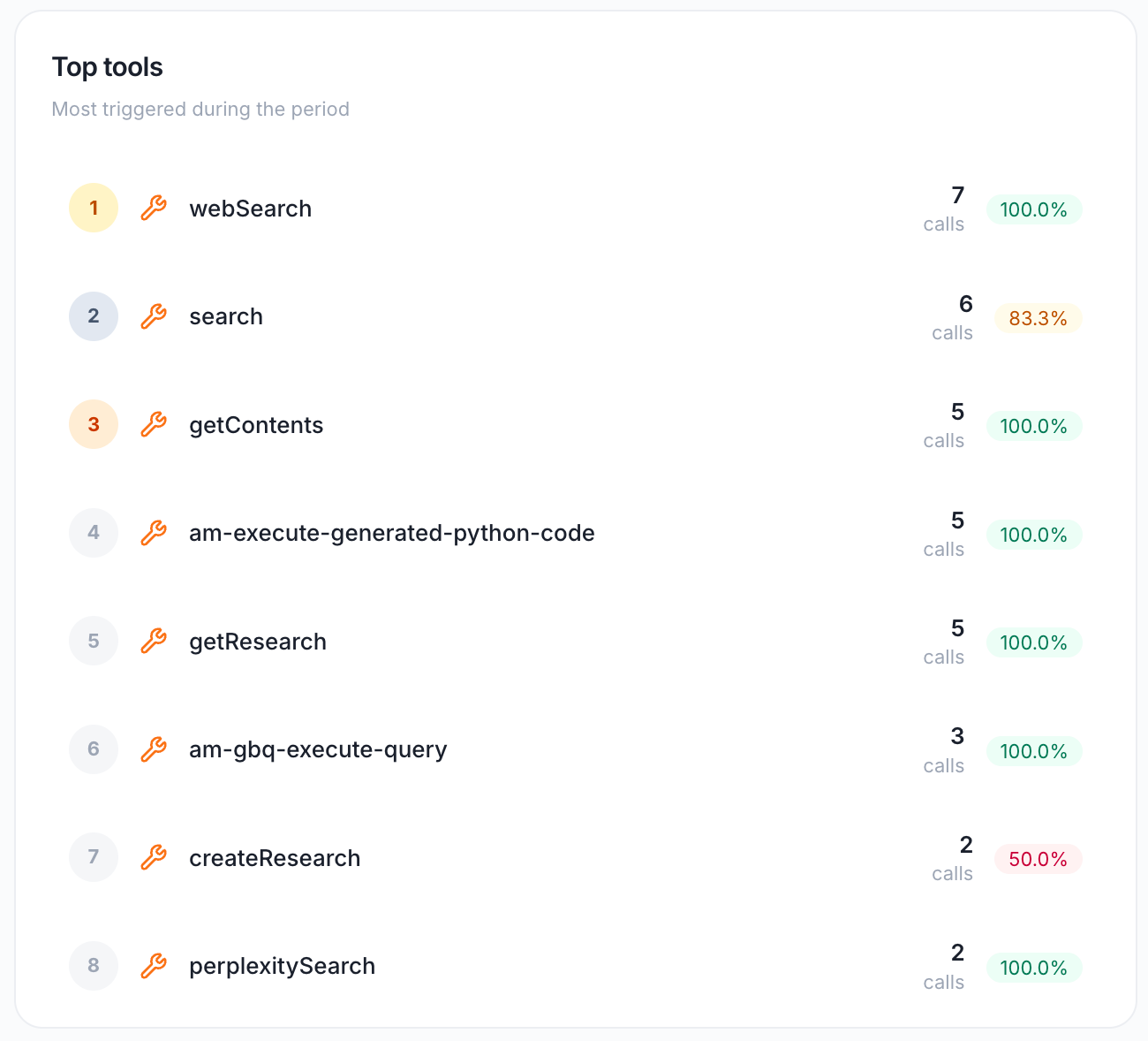
Top Tools
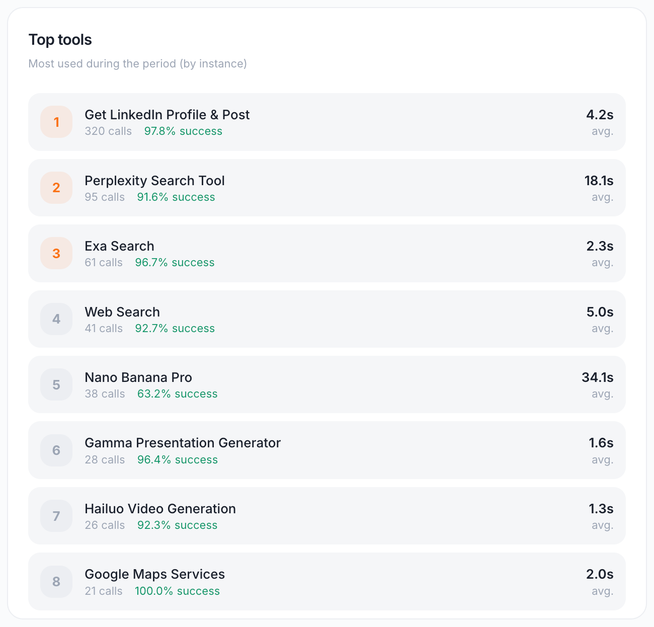
A ranked table of the most used tools (by instance), showing:
Use this to:
Identify your most critical tools
Spot tools with low success rates that need debugging
Optimize slow tools for better user experience
Usage by Agent
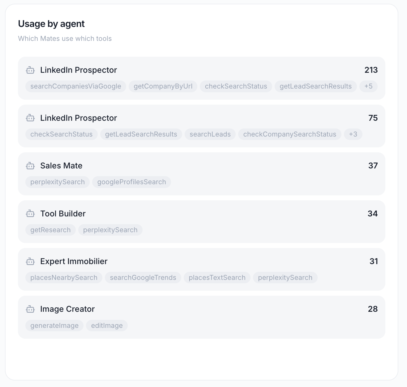
Shows which Mates use which tools.
Displays:
Mate name
Tools used by that Mate
Number of calls per tool
Use this to:
Understand tool dependencies
Identify Mates that rely heavily on external tools
Plan for tool maintenance or deprecation
Top Users
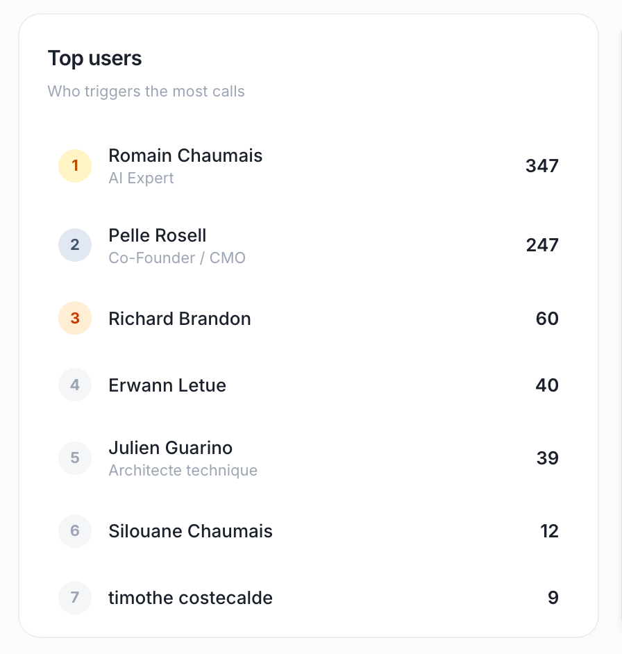
Shows which users trigger the most tool calls.
Displays:
User name
Number of tool calls triggered
Top tools used
Use this to:
Identify power users of specific tools
Provide targeted training or support
Understand usage patterns
Tool Performance
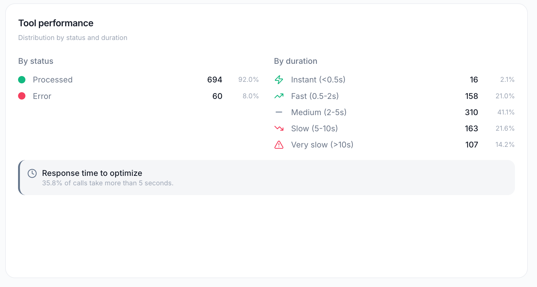
Two distribution charts:
By Status
A donut chart showing:
Success — Completed successfully
Processed — Completed with warnings
Error — Failed
Running — Currently executing (rare in historical data)
By Duration
A bar chart categorizing calls by response time:
Use this to:
Set performance SLAs
Identify slow tools that need optimization
Understand user experience impact
Usage Intensity
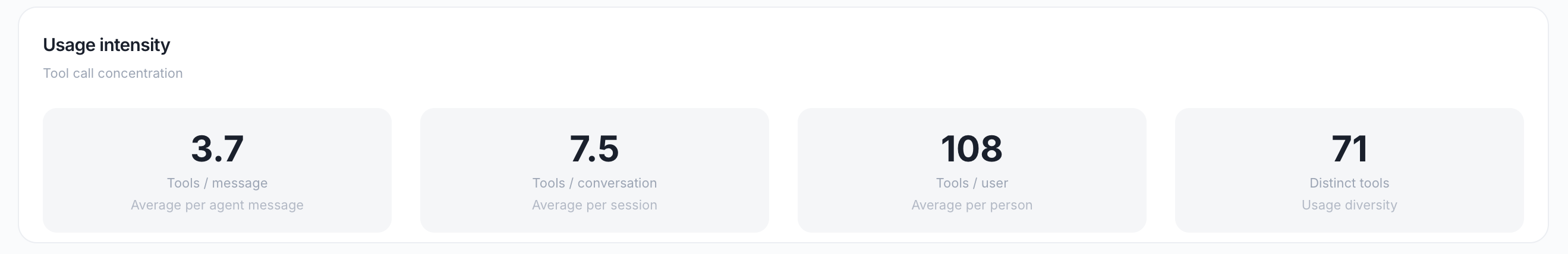
Concentration metrics:
Use this to:
Understand how tool-dependent your Mates are
Identify opportunities to reduce tool calls for cost savings
Benchmark against best practices
Insights Panel
Automated alerts based on current data:
2. Attachments Dashboard
Path: /attachments
Purpose: Analyze file usage, processing performance, and storage.
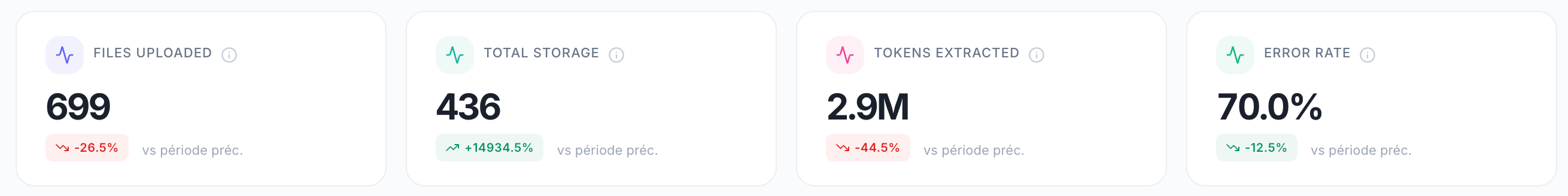
KPI Cards
Files Uploaded per Day Chart
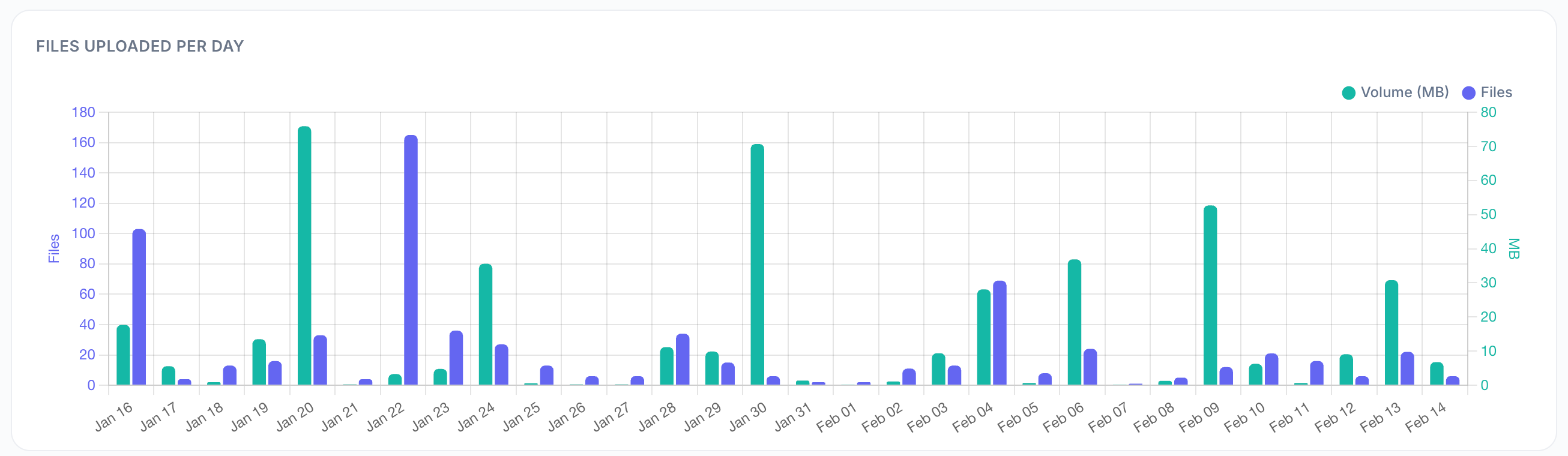
A dual-axis bar chart showing:
Left axis (blue bars) — Number of files uploaded per day
Right axis (green line) — Volume in MB per day
Use this to:
Track file upload trends
Identify peak upload days
Plan storage capacity
File Types
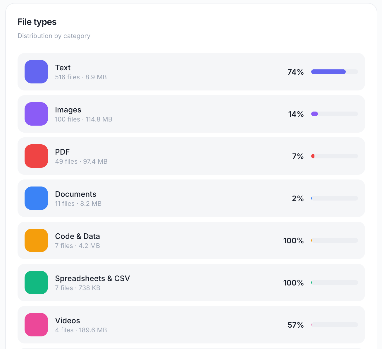
A donut chart showing distribution by category:
PDF — PDF documents
Images — JPG, PNG, GIF, etc.
Text — TXT, MD, etc.
Documents — DOCX, ODT, etc.
Spreadsheets & CSV — XLSX, CSV, etc.
Presentations — PPTX, etc.
Code & Data — JSON, YAML, etc.
Archives — ZIP, TAR, etc.
Videos — MP4, etc.
Audio — MP3, WAV, etc.
Use this to:
Understand what types of content users are working with
Optimize processing pipelines for common file types
Identify unsupported formats that users are trying to upload
Size Distribution
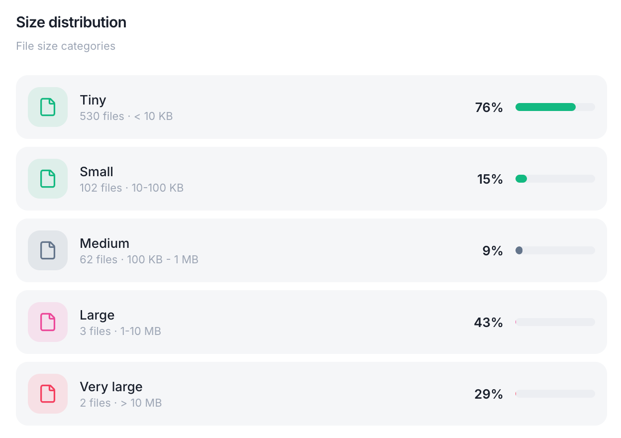
Files grouped by size:
Displayed as: A bar chart showing the count of files in each category.
Use this to:
Identify storage optimization opportunities
Set file size limits
Plan for large file processing capacity
Active Conversations
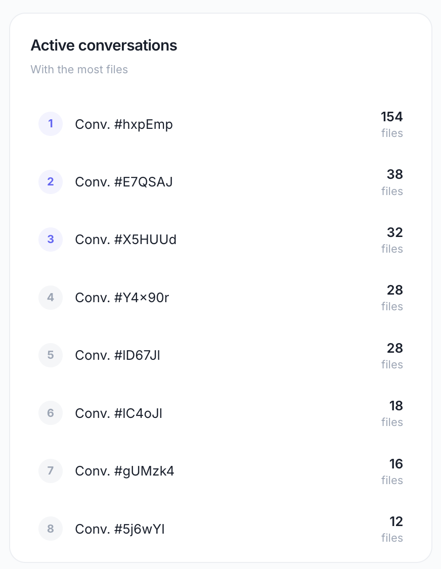
A ranked list of conversations with the most file attachments.
Displays:
Conversation ID or title
Number of files attached
Total storage used
Use this to:
Identify file-heavy use cases
Provide targeted support for users working with many files
Understand how files are used in conversations
Content Extraction
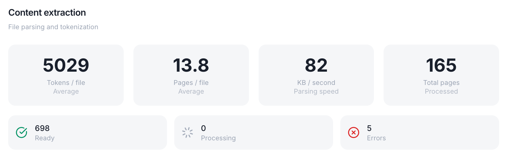
Processing performance metrics:
Use this to:
Benchmark processing performance
Identify bottlenecks in file processing
Optimize RAG pipelines
Usage Intensity
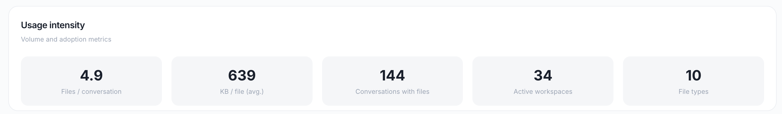
Adoption metrics:
Use this to:
Understand file usage patterns
Identify opportunities to promote file-based workflows
Measure the diversity of file usage
3. Errors Dashboard
Path: /errors
Purpose: Monitor errors, identify root causes, and assess impact.
KPI Cards
Error Evolution Chart
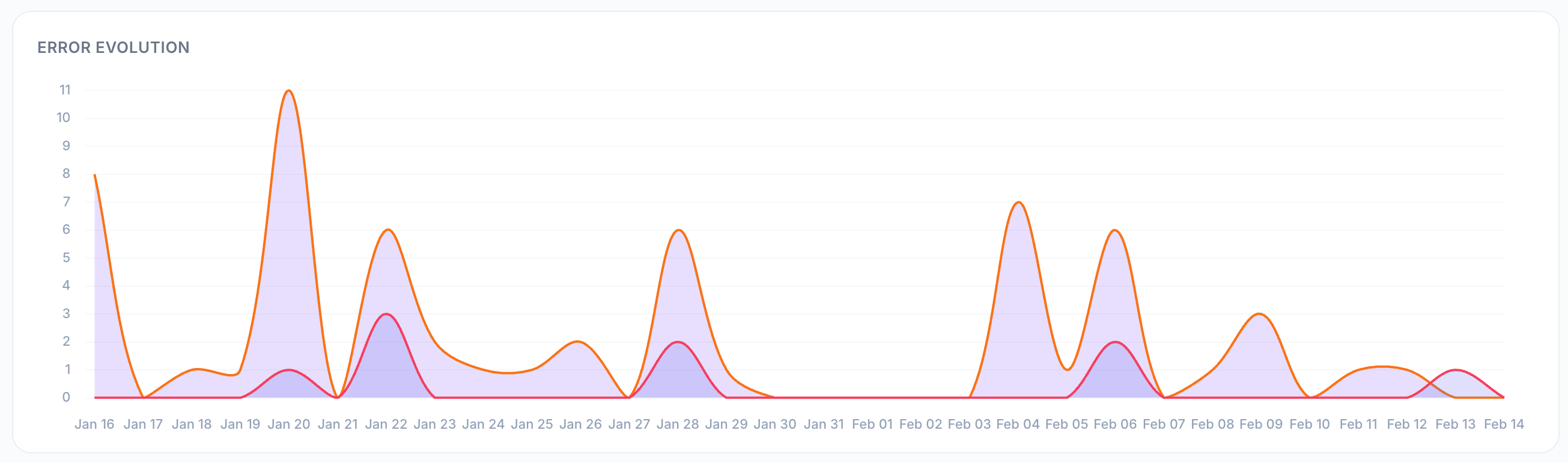
An area chart showing the trend over time for:
Message errors — LLM errors (red area)
Tool errors — Tool call failures (orange area)
Use this to:
Track error trends
Identify error spikes
Measure the impact of fixes or changes
Error Sources
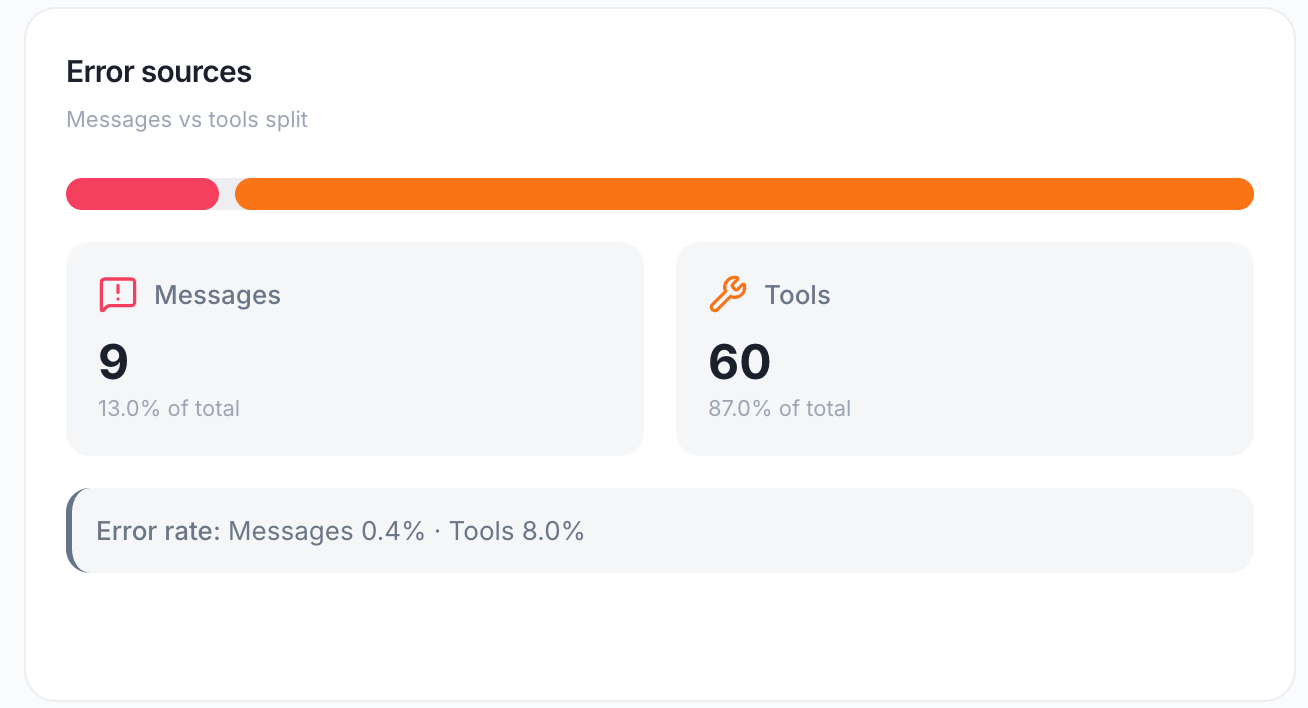
A donut chart splitting errors between:
Messages — LLM errors (model failures, rate limits, etc.)
Tools — Tool call failures (API errors, timeouts, etc.)
Shows: The error rate for each source.
Use this to:
Understand the primary source of errors
Prioritize debugging efforts
Allocate resources to the most problematic area
Error Rate by Workspace

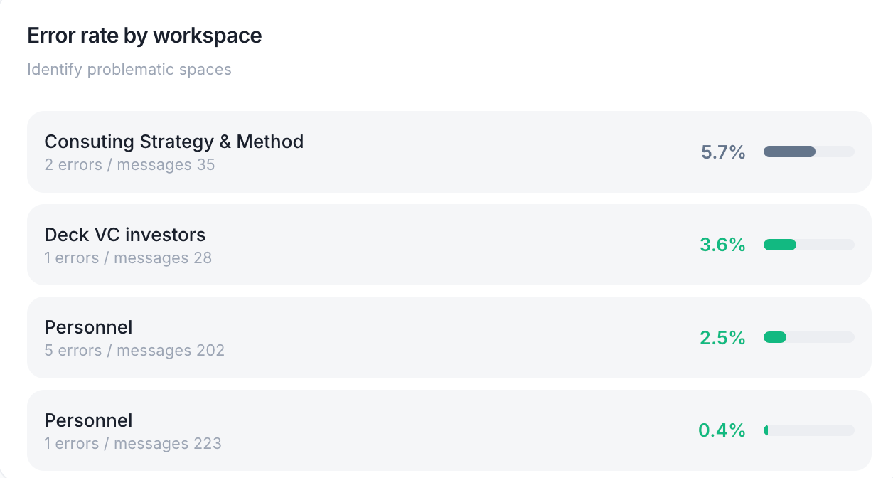
Identifies which workspaces have the highest error rates.
Displays:
Workspace name
Total errors
Error rate (%)
Use this to:
Identify problematic workspaces
Provide targeted support
Investigate workspace-specific issues (e.g., misconfigured Mates)
Error Rate by Tool
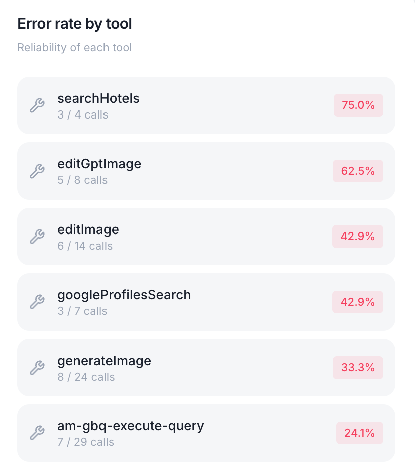
Shows reliability metrics per tool.
Displays:
Tool name
Total calls
Errors
Error rate (%)
Use this to:
Identify unreliable tools
Debug tool configurations
Communicate with tool providers about issues
Errors by Agent
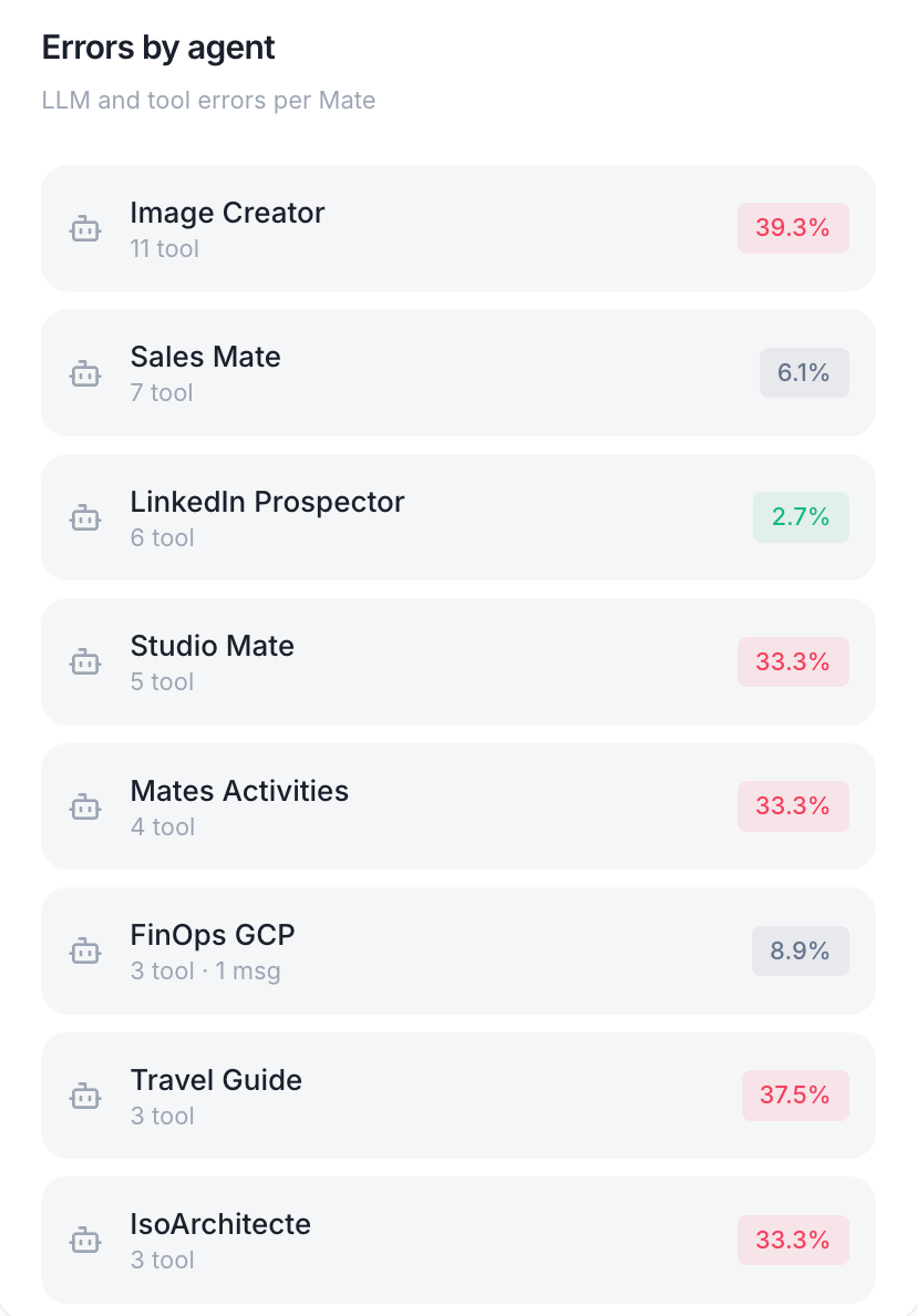
LLM and tool errors per Mate — helps identify problematic AI configurations.
Displays:
Mate name
Message errors
Tool errors
Total error rate (%)
Use this to:
Identify Mates with high error rates
Review Mate instructions or model configurations
Disable or fix problematic Mates
Errors by Model
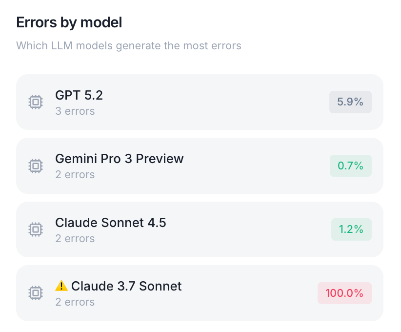
Shows which LLM models generate the most errors.
Displays:
Model name
Total errors
Error rate (%)
Use this to:
Identify unreliable models
Switch to more stable models
Report issues to model providers
Most Impacted Users
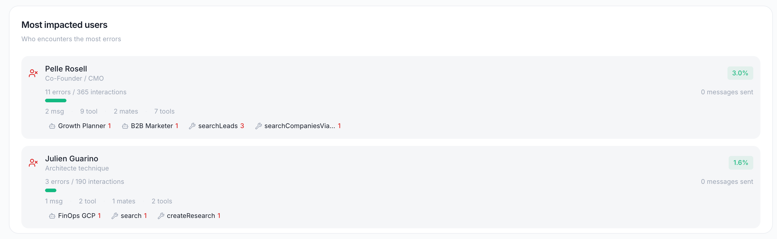
A table showing for each user:
Default view: Top 10 impacted users Expandable: Click "View all users" to see the complete list
Use this to:
Identify users who need support
Understand the user experience impact
Prioritize fixes based on user impact
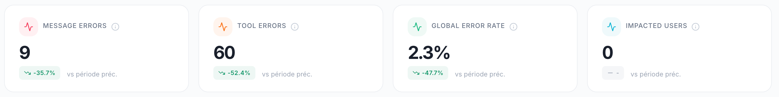
Error Impact
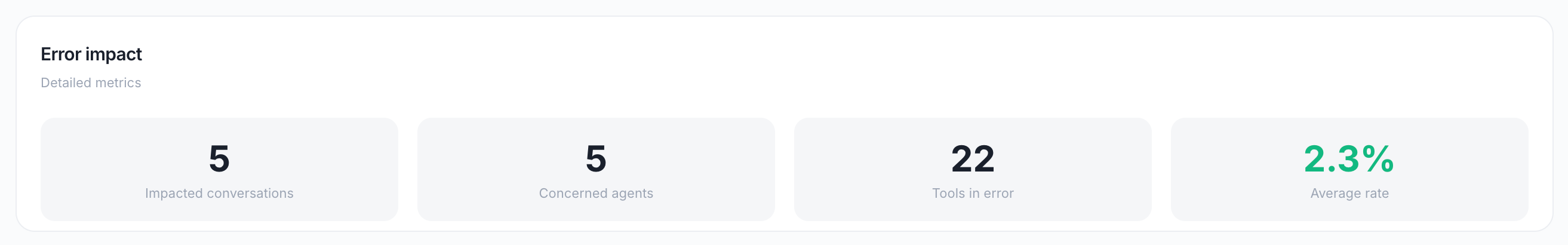
Summary metrics:
Use this to:
Quantify the scope of errors
Report to stakeholders
Set error reduction goals
4. Credits Dashboard
Path: /credits
Purpose: Track Polar quota consumption and native connection costs.
KPI Cards
Note: Credits are tracked via Polar meters. Each meter tracks a specific type of usage (e.g., LLM tokens, tool calls).
Polar Meters
Visual progress bars showing credit quota status per meter:
For each meter:
Meter name (e.g., "LLM Tokens", "Tool Calls")
Global usage bar — Visual representation of consumed vs. allocated credits
Consumed — Credits used
Allocated — Total credits available
Remaining — Credits left
Status alerts:
"Near limit" — >80% consumed (orange warning)
"Over limit" — >100% consumed (red alert)
Use this to:
Monitor quota consumption
Avoid service interruptions
Plan for quota increases
Credit Consumption Evolution
A stacked bar chart of daily credit consumption (Y axis in credits):
LLM credits — tokens consumed per day
Tool credits — tool calls per day
Use this to:
Track spending trends
Identify cost spikes
Correlate costs with business events
Credits by LLM Model
Breakdown of credits consumed by model, each line showing its value (credits × WAC).
Displays:
Model name
Credits consumed
Percentage of total LLM cost
Use this to:
Understand which models are most expensive
Optimize model selection
Negotiate pricing with providers
Credits by Tool
Tool credit breakdown with call counts (prorated estimate).
Displays:
Tool name
Credits consumed
Number of calls
Cost per call
Use this to:
Identify expensive tools
Optimize tool usage
Budget for tool costs
5. User Activity Dashboard
Path: /my-activity
Purpose: Detailed overview of an individual user's activity.
How to Use
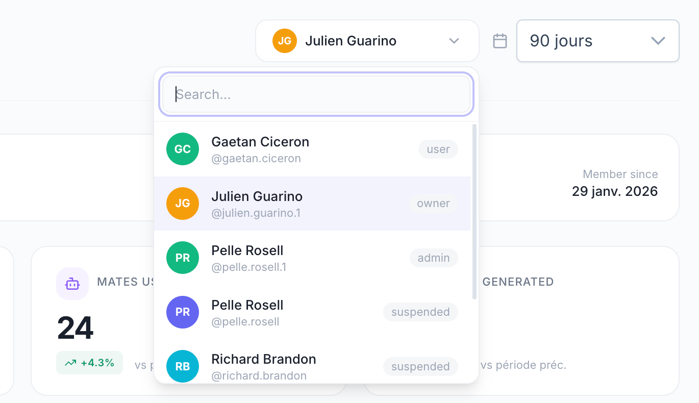
Select a user from the dropdown at the top of the page
Use the search field to find a user by name or username
The page loads all metrics for the selected user and period
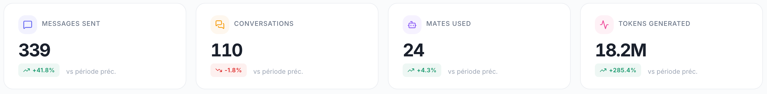
KPI Cards
Daily Activity Chart
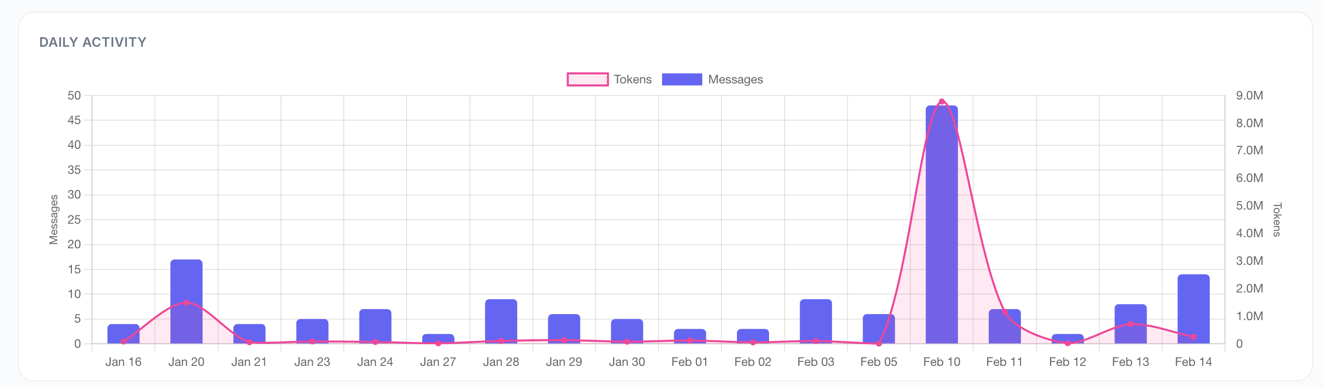
A dual-axis chart showing:
Left axis (blue bars) — Messages per day
Right axis (green line) — Tokens per day
Use this to:
Track individual user engagement over time
Identify usage patterns
Spot anomalies or drops in activity
Favorite Mates
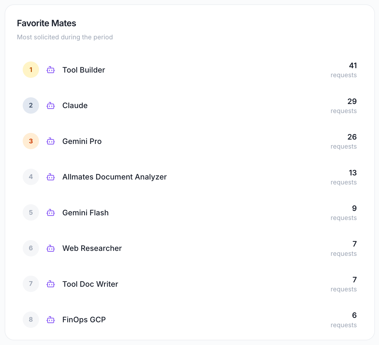
The user's most solicited Mates with request counts.
Displays:
Mate name
Number of requests
Use this to:
Understand which Mates this user finds most valuable
Provide personalized training or support
Identify opportunities to introduce new Mates
Top Tools
The tools most triggered by this user.
Displays:
Tool name
Number of calls
Use this to:
Understand this user's workflow
Optimize tool configurations for this user
Identify training needs
Tokens by Model
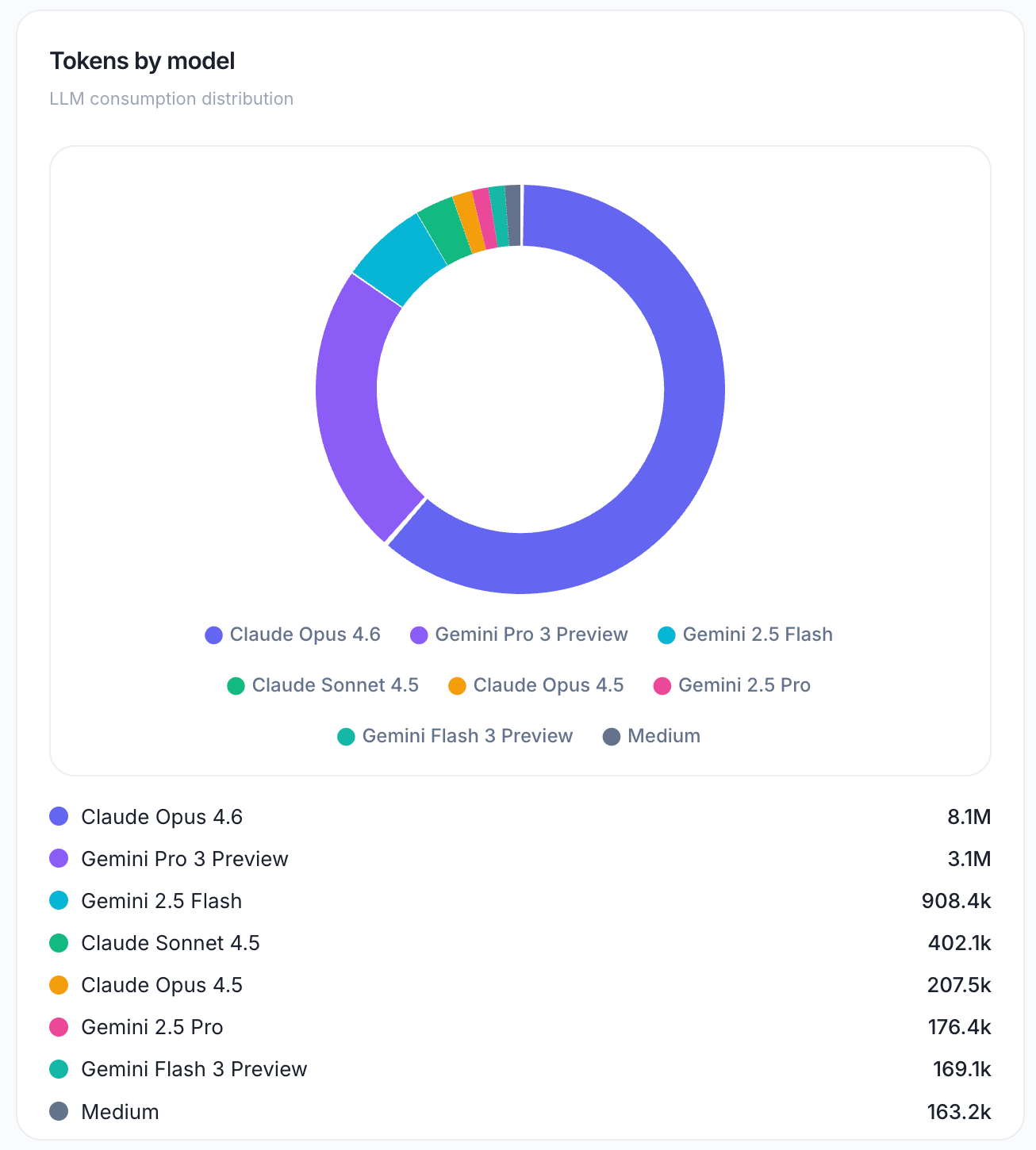
LLM consumption distribution across models.
Displays:
Model name
Tokens consumed
Percentage of total
Use this to:
Understand which models this user prefers
Optimize model selection for this user's use cases
Budget for this user's costs
Workspaces
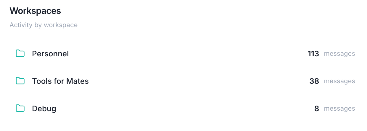
Activity breakdown by workspace.
Displays:
Workspace name
Messages sent
Conversations
Tokens consumed
Use this to:
Understand where this user is most active
Identify collaboration patterns
Provide workspace-specific support