Getting Started with Analytics
Open Analytics, find your way around the header and the sidebar, pick a period and switch organization.
Last updated 14 days ago
Analytics is a dashboard that shows how your organization uses its Mates: messages, conversations, Mates, tools, files, errors, tokens, costs and credits. The data is refreshed every hour. This article explains who can open Analytics, how to open it and how to read the screen. It is for every member of an organization that has Analytics.
Analytics is not included in every offer. If you do not find the Analytics link described below, your organization does not have it.
Who can see what
What you see depends on your role in the organization:
A member without access who signs in sees the Unauthorized Access page.
For a User, see "Viewing your own activity".
Grant full access to a User
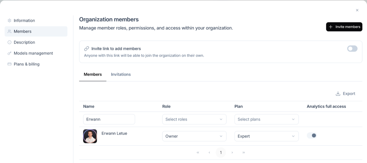
An Owner or an Admin can give a User access to all the dashboards, for example a team lead who follows adoption.
- At the top of the sidebar of the allmates app, click your organization's name.
- Click Settings.
- Open the Members tab.
- In the Analytics full access column, turn on the toggle of the member.
- In the Grant full analytics access? dialog, click Grant full access.
The member can then see all organization analytics, including member activity, segments, exports and costs. The change applies within a few minutes, or at once when the member reloads Analytics.
To remove full access, turn off the toggle. The member goes back to their own activity only.
Open Analytics
Analytics opens in a new browser tab. The link is in the allmates app:
- Owners, Admins and Users with full access: at the top of the sidebar, click your organization's name, then click Analytics.
- Users: open your account menu (your avatar), then click Analytics.
Sign in with the same account and the same sign-in method as in the allmates app.
People with full access land on the Overview page. Users land on the User Activity page.
The screen
Header
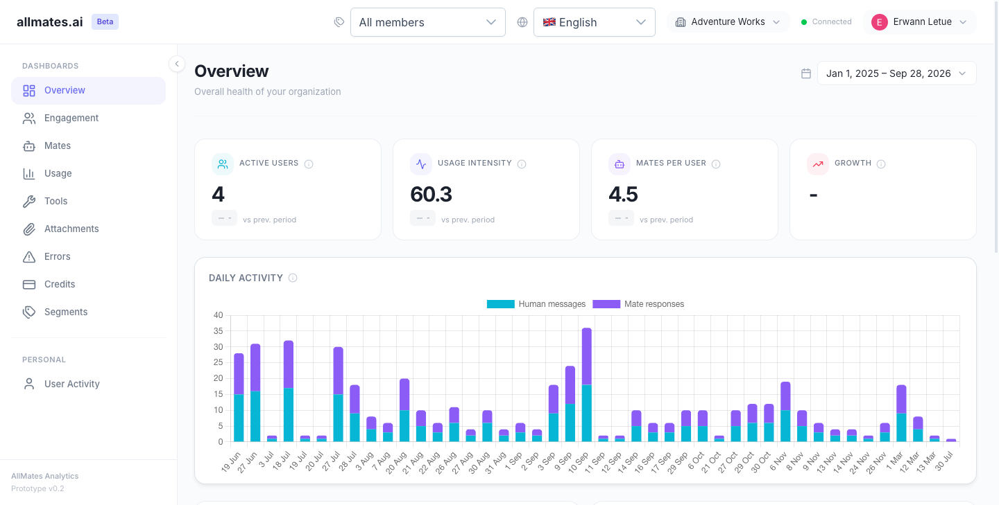
The top bar holds, from left to right:
- Segment: filters every dashboard to a saved group of members. The default is All members. See "Segments: compare teams across every dashboard". Users without full access do not see this control.
- Language: English, Español, Français, Italiano, 日本語, Português or Svenska. By default, Analytics uses your language in the allmates app, or else your browser language. A language you pick here is kept in this browser.
- Organization: the organization you are looking at. See "Switch organization" below.
- Connected or Disconnected: the connection status of the dashboard. If it shows Disconnected, reload the page.
- Your name: open it to find Sign out.
Sidebar
The left sidebar lists the pages you can open:
- Dashboards: Overview, Engagement, Mates, Usage, Tools, Attachments, Errors, Credits and Segments.
- Personal: User Activity.
A User without full access sees only User Activity.
On a computer, click the arrow at the edge of the sidebar to collapse it to icons. On a phone, open the sidebar with the menu button in the top bar.
The dashboards are described in "Strategic Dashboards" (Overview, Engagement, Mates, Usage) and "Operational Dashboards" (Tools, Attachments, Errors, Credits, User Activity).
Switch organization
If you have access to Analytics in more than one organization, the header shows an organization picker.
- Click the organization name in the header.
- Type in Search... to find an organization.
- Click the organization. The dashboards reload with its data.
What you see in each organization depends on your role there. If you have access in one organization only, the header shows its name without a picker. Analytics has no combined view of several organizations.
Choose the period
Each page has a period selector at the top right. The default period is Last 30 days.
- Click the period selector.
- Click a preset: Today, Last 7 days, Last 30 days, Last 90 days, This month, This quarter or This year.
- Or pick a start date and an end date on the calendar, then click Apply.
The period you choose stays the same when you move to another page.
Read the figures
- Comparison with the previous period. A KPI card shows a badge with the change against the previous period ("vs prev. period"). The previous period is:
- Today: yesterday.
- Last 7, 30 or 90 days: the 7, 30 or 90 days before.
- This month, This quarter, This year: the whole previous month, quarter or year.
- A custom range: the period of the same length just before it.
- Badge colors. Green shows a change in the good direction, red a change in the bad direction, grey no change. For metrics where lower is better, such as an error rate, a decrease is green. The badge does not show when there is no data to compare.
- Info icons. Next to each KPI and chart title, an info icon explains what the figure measures. For a KPI, it also shows the formula.
- Charts over time. Charts show one point per day. The First messages chart of the Engagement page groups by week for periods longer than 30 days, and by month for periods longer than 180 days.
Good to know
- The data is refreshed every hour. A message sent a few minutes ago can be missing.
- A role change or the removal of full access applies within a few minutes.
- Costs in Analytics are estimates for monitoring. They are not your invoice. See "Understanding credits".
Related articles
Was this helpful?
Still need help? Ask the team