Strategic Dashboards
Read the Overview, Engagement, Mates and Usage dashboards to follow adoption, retention and usage.
Last updated 14 days ago
The strategic dashboards give a high-level view of how your organization adopts and uses its Mates. They are four pages: Overview, Engagement, Mates and Usage. This article describes each KPI and widget of these pages, and how to find and export inactive members. It is for the people who follow adoption and costs in the organization.
These pages need organization access: you are an Owner or an Admin, or a User with Analytics full access. Analytics is not included in every offer. See "Getting Started with Analytics".
Before you start
- Open a page from the sidebar, in the Dashboards section.
- Each page has a period selector at the top right. Every KPI and widget uses the selected period, except Cohort retention (last 90 days).
- A KPI card shows the change against the previous period ("vs prev. period").
- The info icon next to a KPI or a widget title explains the figure. For a KPI, it also shows the formula.
- The data is refreshed every hour.
Compare adoption between teams
To see the adoption of one team, apply a Segment. Select the Segment in the header (the default is All members). Every KPI and widget of the four pages then counts only the members of that Segment. See "Segments: compare teams across every dashboard".
Overview
Overview shows the overall health of your organization at a glance. People with organization access land on this page when they open Analytics.
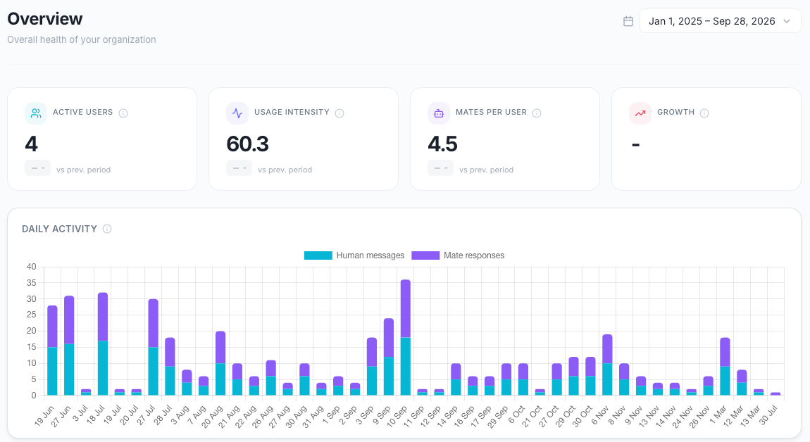
KPI cards
Daily activity
A stacked bar chart with one bar per day:
- Human messages: the messages that members sent.
- Mate responses: the messages that Mates generated.
Hover a bar to see the total of the day.
Use it to spot peak usage days, adoption trends and drops in activity.
Workspace Activity
This widget compares personal and collaborative usage. Personal is the activity in the members' personal workspaces (private chats with a Mate). Collaborative is the activity in shared workspaces.
- At the top, the widget shows the number of active workspaces: the shared workspaces with at least one message during the period.
- Conversations: the number of conversations, split between personal and collaborative.
- Active users: the members who sent messages in personal workspaces and in shared workspaces. A member who is active in both counts in both.
- Mates used: the distinct Mates requested in personal workspaces and in shared workspaces. A Mate used in both counts in both.
Use it to see if your organization uses Mates more for personal productivity or for team collaboration.
Popular Mates
The five most requested Mates of the period. For each Mate, the widget shows the number of requests (messages addressed to the Mate) and the number of users who sent them. Click See all → to open the Mates page.
Use it to find the Mates that deliver the most value and the Mates that stay underused.
Period summary
The key totals of the period:
- Messages: all messages, from members and from Mates.
- Conversations: the conversations with at least one message.
- AI responses: the messages that Mates generated.
- Tokens: the input and output tokens consumed.
- Credits consumed: the credits that the period's usage consumed. See "Understanding credits".
Each total shows its change against the previous period. For Tokens and Credits consumed, a decrease shows in green.
Engagement
Engagement shows user adoption and behavior.
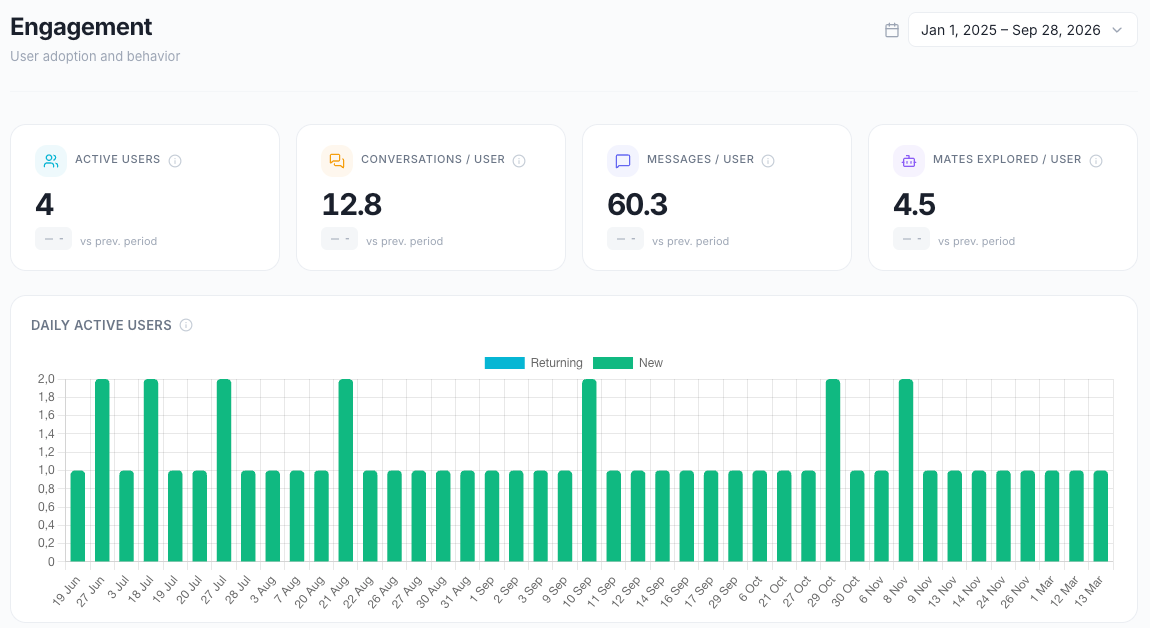
KPI cards
Daily active users
A stacked bar chart of the active users per day, split in two:
- Returning: members who joined the organization before the period started.
- New: members who joined during the period.
Use it to track daily engagement, spot low-engagement days (weekends, holidays) and measure the impact of a training or a communication campaign.
Adoption levels
The active users of the period, grouped by the number of messages they sent:
Each level shows its number of users and its share of the active users.
Use it to find your champions, to spot members who stay at the discovery level and may need onboarding, and to measure the maturity of adoption.
User breakdown
This widget gives two readings of the same population:
- Activation rate: a ring shows the share of members who are Active (sent at least one message) against the members who are Inactive (no message during the period). Suspended members do not count as inactive.
- Among active users: a bar splits the active users between Returning (members before the period started) and New (joined during the period).
Use it to measure overall adoption and to see if activity comes from new or existing members. To see who is inactive, use the Inactive users table. See "Cohort retention and inactive members" below.
Top users
The most active members of the period, ranked by the number of messages they sent. The widget shows the first 10 members. Click View all to see the full list, and Show less to go back.
For each member, the widget shows:
- Top mates: the three Mates they solicited most. Hover a name to see the number of requests.
- Top tools: the three tools they triggered most.
- messages: the messages they sent.
- Days: the days with at least one message.
- Mates: the number of distinct Mates they solicited.
- Tools: the number of tool calls they triggered.
- Tokens: the tokens consumed by their activity.
- Cost: the cost of their activity, in US dollars.
Click a member's name to open their User Activity page.
Click Export to download the full list as a CSV file named top-users-<segment>-<start date>-<end date>.csv. The file has these columns: Rank, Member, Email, Role, Top mates, Top tools, messages, Days, Mates, Tools, Tokens, Cost and Member ID.
Use it to find champions and advocates, and to spot members with unusually high costs.
Engagement trends
Four totals of the period:
- Total messages: all messages, from members and from Mates.
- Conversations: the number of conversations.
- Messages / session: the average number of messages per conversation.
- Mates used: the number of distinct Mates requested.
Total messages, Conversations and Mates used show their change against the previous period.
Use it to spot long-term trends and seasonal patterns, and to measure the impact of a new feature or a new Mate.
Cohort retention and inactive members
The Engagement page has three widgets to follow activation over time and to find the members who stopped using the Mates.
First messages
A bar chart of the members who sent their very first message (Activated users) in the period. The chart shows one bar per day for periods up to 30 days, one bar per week up to 180 days, and one bar per month beyond.
Cohort retention (last 90 days)
This table shows the percentage of users activated in a given week who are still active in the following weeks. It always covers the last 90 days. The period selector does not change it. The Segment applies.
To read the table:
- Each row is a cohort: the members who sent their first message in the same week. The Cohort column shows the first day of that week.
- Size is the number of members in the cohort.
- The columns W0 to W11 are the weeks after activation. W0 is the week of the first message.
- A cell shows the percentage of the cohort that sent at least one message in that week. Hover a cell to see the exact value, for example "Week +3: 42.5%".
- A darker cell means a higher retention. The Retention: legend goes from 0% to 100%.
- An empty cell is a week that has not happened yet.
If no member sent a first message in the last 90 days, the widget shows No cohort for this period.
Use it to check if new members keep using the Mates after their first weeks, and to compare the cohorts before and after an onboarding action.
Inactive users
This table lists the members with no message during the selected period, in the selected Segment. Suspended members are not listed. The subtitle gives the number of inactive members and the Segment, for example "12 members with no message during the period · All members".

The table has these columns:
- Member: the member's name and username. Click it to open their User Activity page.
- Email: the member's email address.
- Role: the member's role in the organization.
- Joined: the date the member joined the organization.
- First activation: the date of the member's first message ever, or Never activated if they never sent one.
The members are sorted by name. To find a member, type in Search a member.... The search looks in the name, the username, the email and the role.
Export the list
Click Export to download the list as a CSV file. The export contains the members that the table shows: if you typed a search, only the matching members are exported. The file is named inactive-members-<segment>-<start date>-<end date>.csv, for example inactive-members-all-members-2026-08-27-2026-09-25.csv. It has the same five columns as the table: Member, Email, Role, Joined and First activation. The column names follow the language of the dashboard. Export is not available when the list is empty.
Re-engage inactive members
- Select the period to check, for example Last 30 days.
- To target one team, select its Segment in the header.
- In the Inactive users table, click Export.
- Open the CSV file and contact the members, for example with an email that presents a useful Mate or invites them to a training.
- Members marked Never activated have never sent a message. They may need an onboarding session first.
- A few weeks later, check the Cohort retention (last 90 days) table and the Inactive users table again.
Limits
- The table reads up to 5,000 members of the Segment. Above that, it shows "List limited to the first 5,000 members. Narrow the segment for an exhaustive export."
- If the period has too many active users, the table shows "Too many active users to compute a reliable list. Narrow the period or segment."
- If every member of the Segment sent a message, the table shows No inactive user.
Mates
Mates shows the performance and the usage of your Mates.
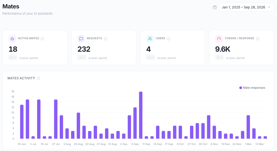

KPI cards
Mates activity
A bar chart of the Mate responses generated per day.
Use it to track the daily workload of your Mates and to identify peak days.
Performance by Mate
The Mates of the period, ranked by number of requests. By default, the widget shows the first nine Mates as cards. Click View all to see every Mate in a table, and Show cards to go back.
For each Mate, the widget shows:
- requests: the messages addressed to this Mate.
- users: the members who sent them.
- days: the days with at least one request.
- conv.: the conversations with this Mate.
- tokens: the tokens consumed by this Mate's replies.
- cost: the cost of these replies, in US dollars.
- tools: the number of tool calls this Mate made.
Use it to find your most valuable Mates, to spot underused Mates, and to review the instructions or the model of the costly ones.
Usage distribution
This widget shows how the requests spread across Mates:
- Top 3 Mates: the share of all requests that goes to the three most requested Mates.
- The five most requested Mates, each with its share of the requests.
- A concentration message:
- ⚠️ Very concentrated usage: the top 3 Mates receive more than 80% of the requests.
- Moderately concentrated usage: the top 3 Mates receive more than 50%, up to 80%.
- ✓ Well distributed usage: the top 3 Mates receive 50% or less.
Use it to see if your organization depends on a few Mates.
Cost overview
The cost of the period:
- Credits consumed: the credits that the period's usage consumed, with the change against the previous period. A decrease shows in green.
- Total tokens: the input and output tokens consumed.
- Cost / user: the cost divided by the number of members who sent at least one message to a Mate.
The costs are estimates for monitoring, not your invoice. Click Details → to open the Usage page.
Usage
Usage shows tokens, costs and optimization.
KPI cards
Total cost is an estimate for monitoring. It can differ from your invoice.
For Credits consumed, Total cost and Cost / user, a decrease shows in green. See "Understanding credits" for how credits work.
Usage evolution
A bar chart with one pair of bars per day:
- Tokens, on the left axis.
- Cost ($), on the right axis.
Use it to track spending trends, to identify cost spikes and to relate usage to business events.
Most used models
The five models with the most tokens during the period. For each model, the widget shows the model name, the tokens, the cost in US dollars, and the model's share of the tokens of the five models listed.
Use it to check if expensive models are overused, and to consider a more cost-effective model for some use cases.
Top mates by cost
The five Mates with the largest model cost during the period. For each Mate, the widget shows the Mate name, the tokens, the cost in US dollars and a percentage. The percentage compares the Mate with the ten most expensive Mates of the period, not with the whole organization.
Use it to find the Mates to optimize first, for example with a lighter model or shorter instructions.
Top users by cost
The five members whose activity cost the most during the period. For each member, the widget shows the name, the tokens, the cost in US dollars and a percentage. The percentage compares the member with the ten members whose activity cost the most, not with the whole organization.
Use it to spot unusual consumption patterns.
Good to know
- The data is refreshed every hour. A message sent a few minutes ago can be missing.
- Costs in Analytics are for monitoring. They are not your invoice.
- A KPI card shows no trend badge when there is no value to compare.
- The cost of a member's activity includes the Mate replies that the member triggered.
Related articles
Was this helpful?
Still need help? Ask the team